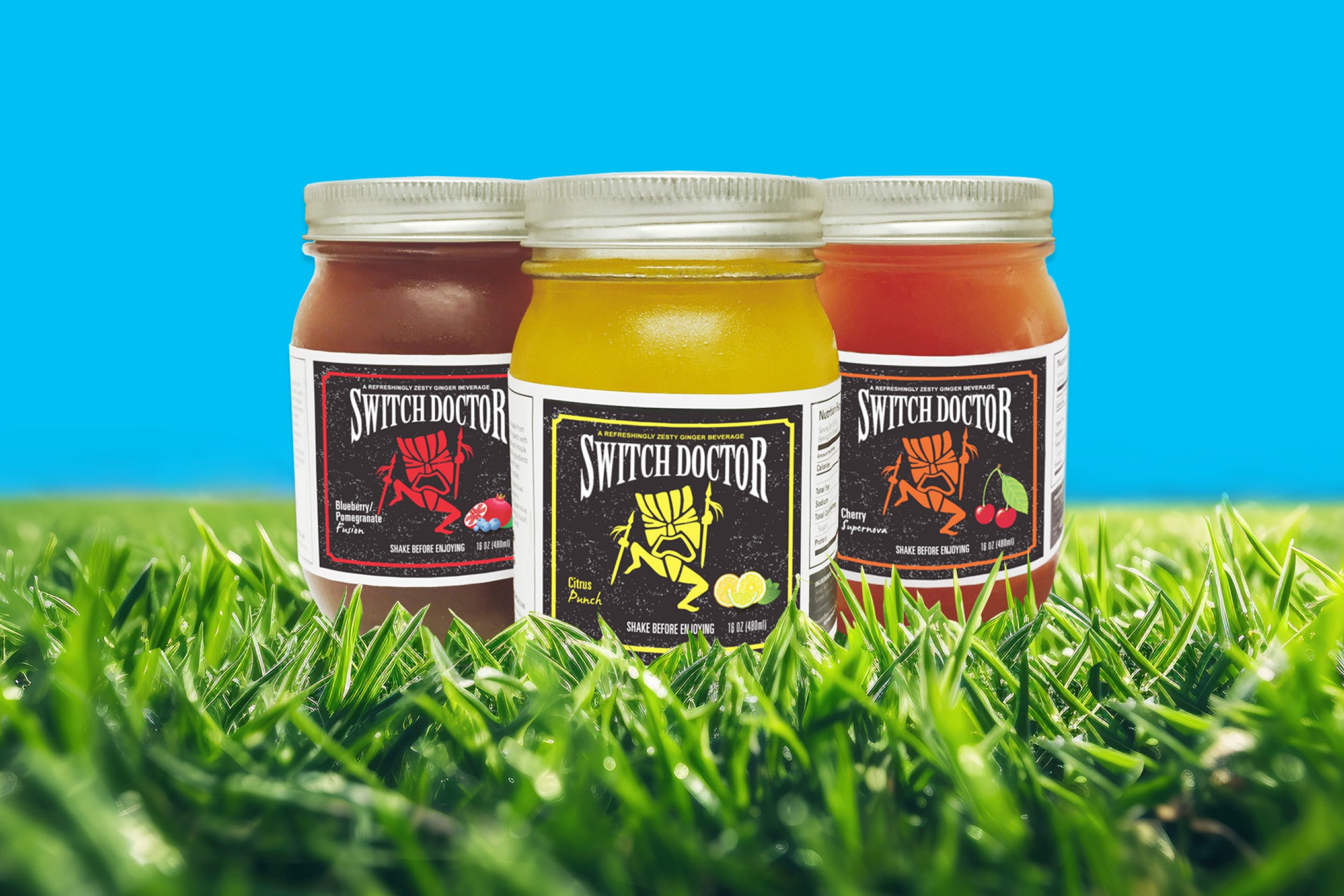
Brand identity for a non-profit community resource center formally the “Union Community Hospital,” named after its founder, Dr. Lawrence W. Long—who, from 1954 to 1975, headed the only hospital that provided medical service to the black community of Union, SC.
The new logo combines two ‘l’s into an abstract heart, representing Dr. Lawrence Long, and it is a powerful symbol that connects the historical legacy of the Resource Center and its continued commitment to service: providing counseling, literacy, and employment services meant to empower and uplift those in the Union community.
Syntric Solutions, an independent IT security company, needed a brand identity for its launch.
The created logo mark is a series of layered elements that intersect, representing the integrated security services that Syntric Solutions provides in today’s complex IT environment.
Created the brand identity and package design for Switch Doctor, a limited-release, unique, 100% all-natural ginger-infused hydration drink founded by an independent beverage entrepreneur.
The “Switch Doctor” icon represents the mixologist creating the distinctive flavors: Citrus Punch, Blueberry Pomegranate, and Cherry Supernova. The package design reflects the colors of the fruits used to create each drink.
Brand identity and social media engagement campaign for a health-related data gathering initiative.
The logo embodies the partnership between those who provide their medical information and the researchers who turn that data into discovery. The three dots symbolize data.
The social media campaign makes an emotional connection with research participants. The messaging line, “I share because I care,” speaks to the care for the health-wellness of others. The dots frame the messaging, and the tagline, Taking Data to Discovery, clearly articulates the brand’s purpose.
2030 Water Resources Group, a World Bank Group division, aims to close the global water demand and supply gap through multi-stakeholder partnerships. When asked to design the 10th Anniversary issue of their annual report, the goal was clear: the cover design should make a strong visual impact and the interior clean and modern, showcasing their program’s achievements in multiple countries over the past ten years.
The report’s design used striking photos, graphic icons representing projects, full-page country profile infographics, and unique map timelines to help tell the stories of how WRG met water challenges and achieved success over the past ten years.
LGS Specialty Sales, Ltd., a produce importer, aimed to introduce its latest, “Clementines,” a unique citrus product imported from Spain to the American consumer. They needed this new product to stand apart from the known brands American consumers buy. The branding challenge was to name the product and give it a signature tagline, a unique visual identity, and consumer-friendly packaging.
The name “Darling Clementines” resonates with familiarity, and that familiarity gave the Clementines instant consumer recognition. The tagline—Nature’s Sweet Temptations—speaks to its uniqueness.
The package design is bold and inviting, using warm blue and vibrant orange—making it visually striking and easily recognizable in grocery stores. Darling Clementines has become one of consumers’ most popular clementine brands. LGS has become one of the leading importers of Clementines to the U.S.
Serving members in Bergen, Passaic, Essex, and Union Counties, North Jersey Federal Credit Union needed to refresh its logo mark dating back to 1936.
The logo was refreshed and modernized. Updated its size and shape, partnered it with a distinctive typeface, giving the logo a strong, unique personality, and introduced a new color palette of bold blues, green, and black with tones of gray.
The rebranding included credit cards and internal/external marketing communications (advertising, display ads, brochures, direct mail, social media ads, stationery, and web banner ads).
Logos created for large and small businesses, public and private organizations, and special events that span many industries.
Brand identity, naming, tagline, and website for a non-profit colorectal cancer organization.
Bluem, a non-profit organization, was born out of a desire to provide colorectal cancer patients access to a community that educates, connects, and empowers them from the moment of diagnosis.
Bluem’s unique logotype illustrates movement, signaling growth and transformation; the flipped colon cancer ribbon creates a bouquet of blooming flowers, capturing a sense of optimism. Each petal symbolizes the three pillars of Bluems’ mission of empowerment, community support, and education. The visual expression is engaging and has a positive tone.